Tuesday 31 March 2015

The End

As I approached the end of the design process, I began to feel that the name Rolex House was rather bland. It was then that I decided to christen the building as Wilsdorf House, in honour of one of the founders of Rolex, the German watch-maker Hans Wilsdorf. This little touch completed, I set about putting the entire build together, as a series of animations:


Surprisingly, it all developed out of this one drawing:


However different it may be visually from the final product, I think the same ideas and basic forms are still there.


Finishing Touches


With the fundamentals in place, it was now time to make some final refinements, starting with the landscape itself. To provide more of a sense of place, I added a stretch of water, and a sandy beach, along with a road by which the building is to be approached.


Such a view demanded a window to view it from, and this was added to the ocean facing point of the building:


It provides a nice space in which the designer can consider Rolex's qualities of boldness, delicacy and refinement, embodied in the abstract imagery that adorns the wall.

(chair model courtesy of "KARE Sketchup")

The view from the chair:


And the view from the balcony:


I finally went about converting my ideas for the underground portion of the building into reality, producing a design which alludes to both the original conception of descending, concentric rings and of the physical structure of a Rolex watch:


A watch and clockwork piece left mid contemplation:

(models courtesy of "model citizen","jon", and "Smart Furniture")


The Stairs Concluded

It was now necessary to refit the crumpled stair design to the new form of the building. I decided to place the stairway in a central atrium, connecting two internal balconies via a sweeping bridge, with the twin staircases being reflections of one another. The following model was developed:


Which fits in the building as such:


A set of stairs in the same, crumpled style needed to be developed to connect the ground floor to the below ground studio space. These would be fitted into the inland facing triangular room, yielding the following design:


Which fitted into the building as such:


With the stairs finished at last, it was time to put the finishing touches on the model.


Texture and Materiality


As a group exercise, 36 words were recorded which represented the various possible qualities of a material. These were then classified as either above ground, below ground, or in-between, in reflection of the original sketching exercise. As an individual, I produced a small drawing for each adjective, such that it could be used as a texture in my Sketchup model.

Above:


1) Bold Brushed Crisp 
2) Delicate Exuberant Fractal
3) Icy Opaque Rarefied
4) Refined Rounded Sharp
5) Shiny Sinusoidal Smooth
5) Synthetic Transparent

In-Between:


1) Bushy Cratered Fiery
2) Fuzzy Hairy Homogeneous
3) Restrained Rugged Shaggy
4) Warm Welcoming


Below:


1) Cold Gritty Industrial
2) Metallic Oppressive Raw
3) Robust Rusty


Tuesday 24 March 2015

Another Re-design

I felt that my new version of the Rolex building lacked much of the dynamism of the original drawing, and so a re-design was in order. Returning to the original spiky idea, a sketch was drawn, much in the same vein as the original:


This was effectively a hybrid of the first two iterations of the design, and was an improvement on the second. The issue of how to project this into a three-dimensional model still remained, and I was far from happy with my attempts to do so. However, I was particularly taken with the idea of the angular podium, projecting out from a raised ground, and decided to incorporate this feature into the design. I returned to paper again, producing more sketches:


While more restrained and controlled than the previous two designs, I felt that it was a much more successful concept. By having the front and back of the structure come to a point, the issues of bulkiness and heaviness in the earlier iterations was effectively addressed. Furthermore, by having the two smaller side projections act as the entrances, the building is made more relatable and amicable to the visitor by reducing it to the human scale. The skylight section allows natural light into the building in a controlled, Soane-like way, allowing the main thrust of the building to remain uninterrupted, to dramatic effect. This new form is also more conducive to the idea of  a podium, as that structure could be designed simply as a scaled up version of the main building's footprint. With these sketches at hand, I set about converting them to a model:


I then set about producing a landscape for the building to rest in, using the contour feature of Sketchup:


I was quite happy with how the structure and its podium sat in the landscape, projecting dramatically above the surrounding land. I was also taken by the way the building changed as you neared it along the gently sloping  causeway that acts as an approach:


With the building much improved, it is now time to address the stair issue.


Monday 16 March 2015

Designing the Stairs


It was now time to try and produce a set of stairs to connect the upper and ground levels of the Rolex Building, ideally in a style befitting the exterior of the building.


I started by producing the basic shape of the stairs, with the main flight leading to the mezzanine and a bridge. I wanted a fairly shallow pitch to the structure, so the steps are the minimum allowable dimensions (a riser of 150mm by a tread 215mm).


Next, the basic shape of the balustrade was added, along with a flare at the base of the stairs, helping them to integrate with the room as well as making them more inviting to use.


The balustrades were then divided into a grid of rectangles, which was to be the basis of the final form of the stairway.


This was to be the method by which I addressed the difficulty of making a "natural" looking crumpled surface. I had found that consciously trying to produce the effect only resulted in contrived looking surfaces, and so I determined a way to randomise the process. Using a random number generator, a set of three integers would be produced for each individual rectangle, such as {3,-1,5}. Each entry in the set corresponded to a particular axis, and a positive or negative value indicated a direction along that axis. With the sets generated, a given rectangle was then moved in accordance with the numbers in its corresponding set, thus distorting the surface. For instance, a set of {3,-1,5} would result in the rectangle moving, say, 30mm along the positive red axis, 10mm along the negative green axis, and 50mm up the blue axis. This was the end result:


Although not yet perfect, I was rather pleased with the result. 


As an extra touch, the steps were themselves altered to slant inwards. It is hoped that LED strips may be placed in these little coves, producing a pleasing light effect on the steps in the evening and at night.


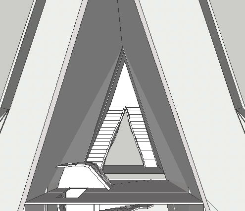
Finally, I placed the stairs in a  mock-up of the atrium, to help provide a sense of how the stairs will interact with the building as a whole.


Sunday 15 March 2015

A Total Reworking

I had been trying for some time to convert my two-dimensional sketch of the Rolex Building into a three-dimensional model which I could develop further. It had been a real struggle, with the results being either uncompromisingly ugly, or B-grade replicas of either the Sydney Opera House or the Guggenheim Museum. With these failings in mind, I set about a total redesign of the building. Inspired by the works of Libeskind, I simplified the silhouette of the building to a few essential peaks, and within the hour I had a very basic prototype.


The new design retains the basic angular characteristics of the original, but in a simplified way. The skylight and internal mezzanine remain, as does the raised podium. We also see in these sketches the new concept for the windows.


It's obviously no Gehry masterpiece, but it is definitely a step in the right direction.

A Bit of Research - Daniel Libeskind


At this point, I decided to have a look into the work of some prominent deconstructivist architects, as well as reading up on some of the more common criticisms of the style. While looking around, I was particularly struck by the work of the Polish-American architect Daniel Libeskind, and decided to look into him further.


The Imperial War Museum North, completed in 2001 in the city of Manchester, is one of the buildings that most appealed to me. I produced a number of sketches of the building, but none that really do it justice. There is something in the massing and arrangement of the structure that my admittedly limited sketching skills cannot convey.


The building at right, The Ascent at Roebling's Bridge, was completed in 2008 in the town of Covington, Kentucky, and it's a striking piece of architecture. The thing that most appealed to me was the soaring quality of the tower, which is something that blocky and heavy deconstruction often struggles to convey.


Again, the building inspired a number of sketches, again, none of which perfectly convey the character of the building.


Nevertheless, the research was an invaluable exercise, and one that inspired a significant rethink of the theoretical Rolex building.


Stairs - First attempt


If the building is to act as both a showroom and a workshop, then there needs to be some kind of demarcation between the two spaces. One way to achieve this is to simply have the two areas on different levels, connected by a flight of stairs. This affords an interesting opportunity to produce a unique and impressive set of stairs, by which the client can be introduced to the wares on offer, creating a first impression like no other.


I wanted to try and create a set of stairs in the deconstructivist style, to which my initial design seemingly belonged. To that end, I set about drawing a stairway with jagged edges, lined with sharp, irregular polygons in an allusion to the buildings outside shape.


I toyed with the idea of having each step separate from each other, however I decided that this clashed with the continuous form of the, for want of a better word, banister. I also determined that I wanted the path up the stairs to continue, and to bridge the atrium, creating a dramatic central space.


With the layout of the space more or less formalised, I set about deciding how to produce a model of the stairs themselves. I realised I could make the jagged bannister by simply combining a series of pre-made polygons at varying angles and positions, to try and create the effect I wanted.


This represents the first attempt to model these stairs, and I was not as satisfied with the result as I hoped to be.


The effect wasn't as pronounced as I had wanted, and the conventional steps felt out of place with the anarchic trimming. It was obvious that a redesign was required.


Incidentally, the most successful part of the design was the underside, which was covered with a distorted plane, much like an un-ironed shirt. I decided to try and produce the entire stairway in this material. The difficulty was in producing a surface that somehow looked natural, as if the material naturally assumed that shape, and not contrived and over-designed.